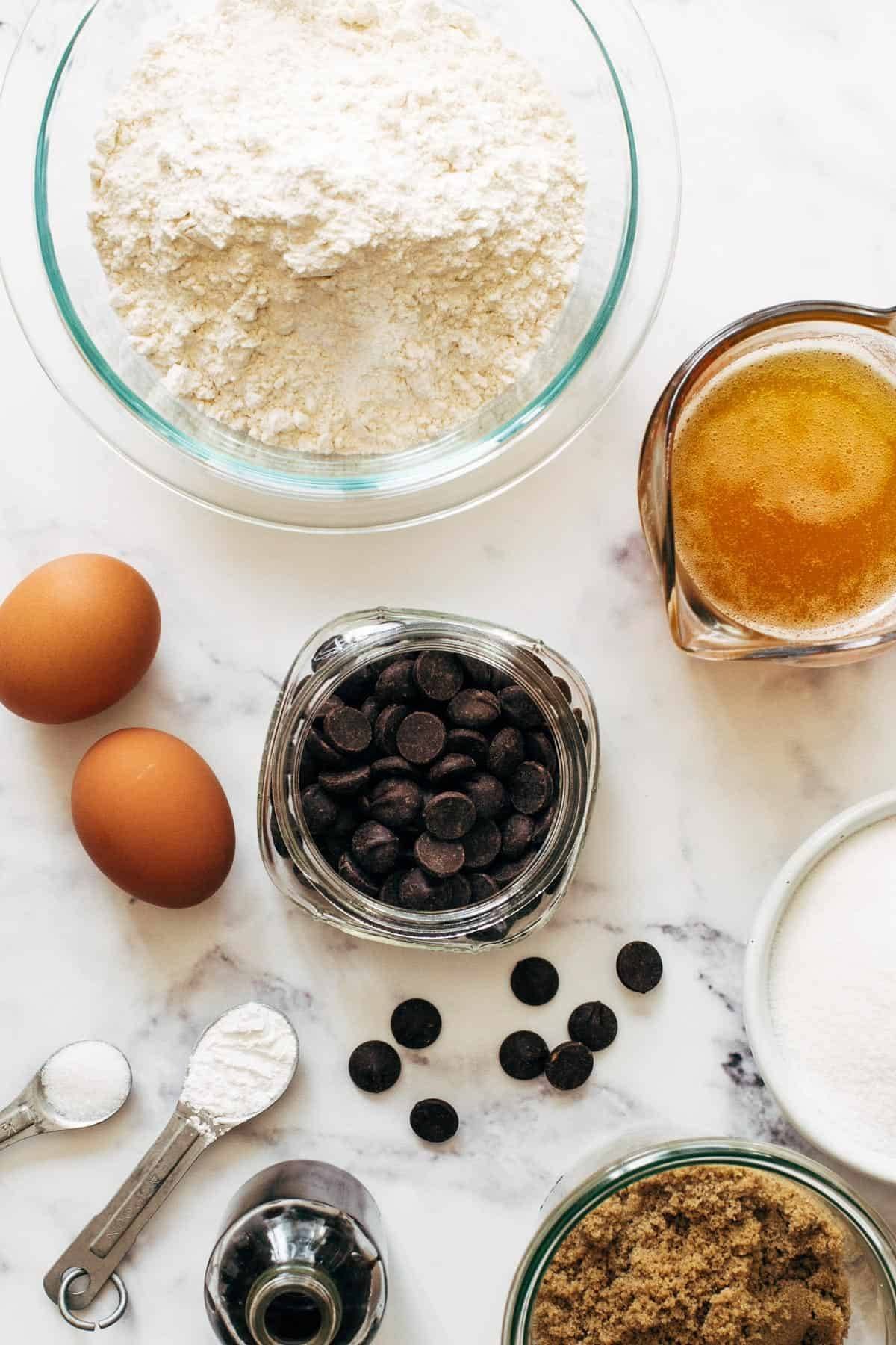
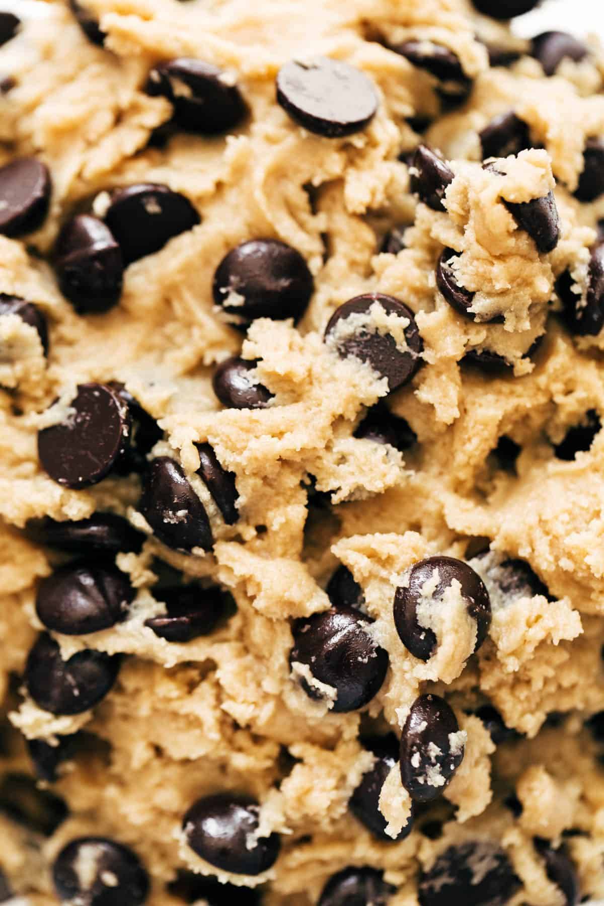
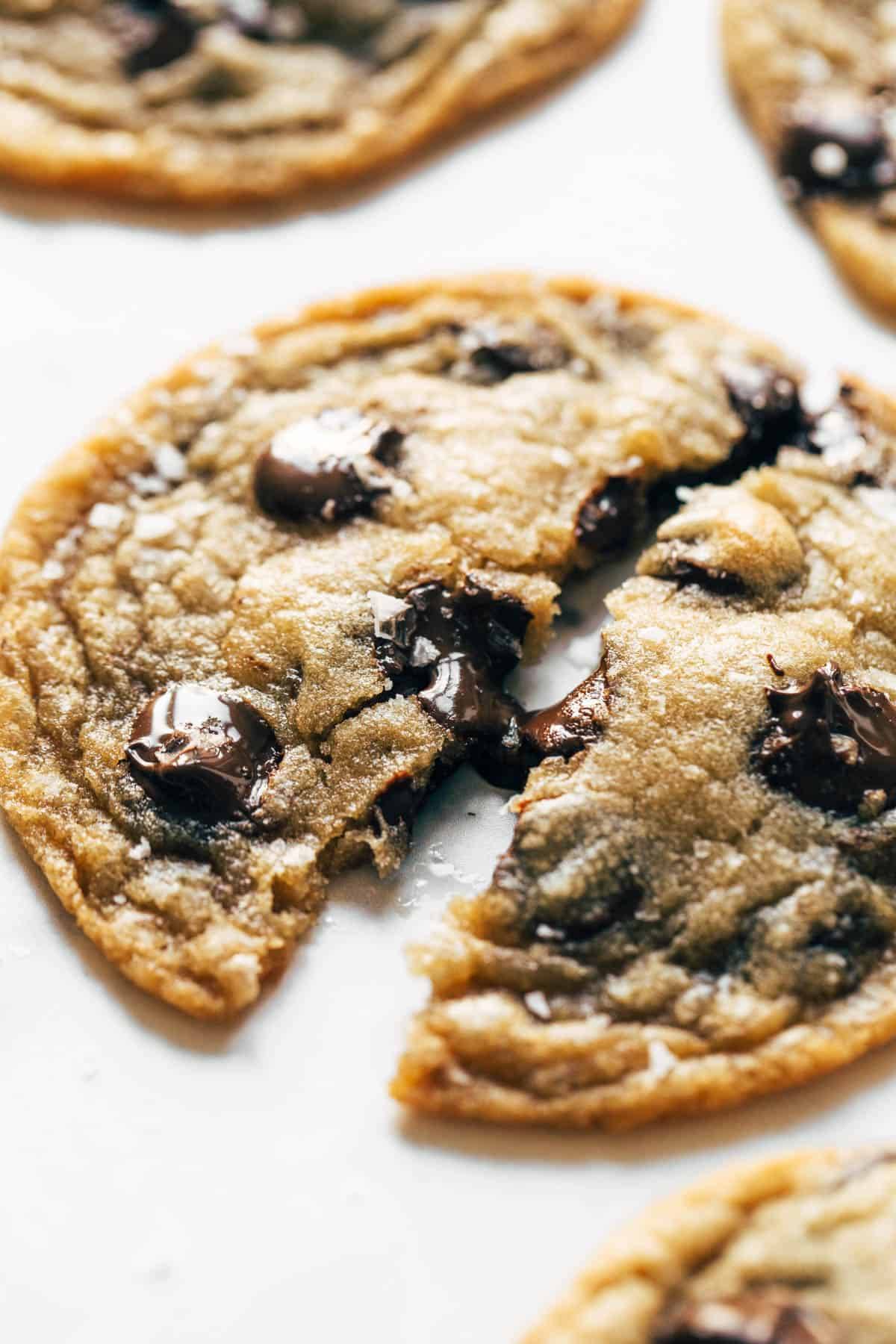
The cookies are rooted in classic Toll House flavor, but browning the butter amps up the toasty notes and is key to developing the balance of crisp edges, while a high ratio of brown sugar to white sugar ensures chewy chocolate chip cookie centers. The amount of flour and the quality of the pure vanilla extract is important here. We highly recommend weighing your flour with a scale; if you don't have one, use a spoon to scoop the flour into a measuring cup until overflowing, and a straight edge (such as the back of a butter knife) to level it off.


Bon Appetit is the recipe site I chose to use for this project. Something I think it does well is reiterate the amount of each ingredient in the instructions to clarify how much to use so the user doesn't have to scroll up to view the ingredients list. Additionally, the ingredients and their amounts in the instructions are bolded, differentiating it from the rest of the text. Something I wish this recipe had was images to allow the user to understand what the recipe should be looking like at the various stages of making the cookies
Broma Bakery is another example of a recipe site. At the top of the page, there is a "jump to recipe" button that allows the user to skip over all the description and explanations that would take a while to scroll through. Another feature on this website that I think is user-friendly is being able to toggle between US measurements versus Metric measurements, widening the usability for a wide breadth of users.
Tasty is another example of a recipe site. Something that I think it working well on this site is the use of two columns—one for the ingredients and another for the instructions. This way, the user can refer to both at once without having to scroll to find measurements for ingredients listed in each step.
Garden Design is an example of a non-recipe website. This page of the site explains how to properly grow a plant. I think something I can take inspiration from here is how the text and images are treated. Each step of the process is split into three sections with more detailed steps and is accompanied by one supporting image. This layout is something I can implement in my site.
This page on the Nike site is another example of a non-recipe site that integrates short video clips with instructions on how to tie shoe laces 4 different ways. The short video clips explaining how to tie the shoe each way could be something I take inspiration from for my recipe site to further help with clarity of steps.
This page on wikiHow is a third example of how instructions and images can be integrated. Each step is accompanied by an illustration that displays the step, furthering clarity by visually demonstrating each step.